Food Finder: The Ultimate Landing Page for Food Apps
Let's be honest: the food app market is crowded. Your mobile application might be brilliant, but if the front door—the landing page—is cluttered, confusing, or uninspired, users bounce before they ever see your features. That is where the Food Finder - Mobile App Website Landing template comes into play. It is not just a collection of screens; it is a strategic tool designed to bridge the gap between a casual browser and a hungry user. This design focuses on high-impact visuals and frictionless navigation to ensure that the first impression is as satisfying as the meals your app helps users find.
Visual Harmony and the Art of Culinary Presentation
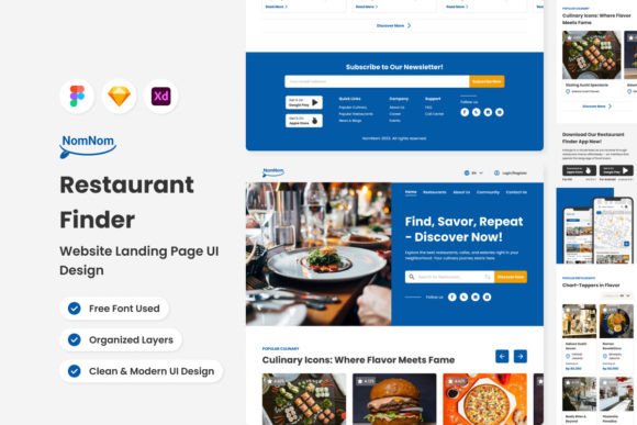
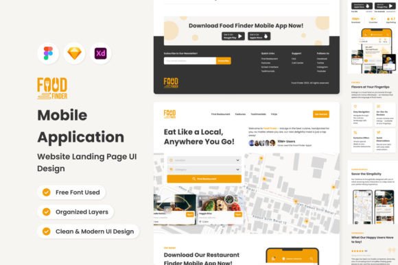
When you open the Food Finder file, the first thing you notice is the balance. The layout employs a modern typography approach, utilizing clean sans serif fonts that prioritize readability without sacrificing personality. In the world of food, presentation is everything, and this template treats text with the same care a chef treats a garnish. The visual hierarchy is distinct—large, bold headings grab attention, while lighter body text guides the eye through the features. This isn't just about looking pretty; it is about creating a logical flow that directs the user toward the "Download" or "Sign Up" buttons.
The color palette and spacing are engineered to let the food photography breathe. If you have ever struggled with overlaying text on busy images, you will appreciate the semi-transparent containers and strategic negative space used here. This design choice ensures that your brand identity remains front and center. Whether you are building a high-end dining guide or a casual street food locator, the template's neutral yet warm tones provide a versatile canvas. It feels professional and trustworthy—two essential ingredients for any successful web design project in the hospitality sector.
Practicality Meets Design: Why This Template Works for Professionals
For designers and entrepreneurs, the value of a template lies in its flexibility. The Food Finder - Mobile App Website Landing page is built with a component-based structure, meaning the layers are meticulously organized and named. This is a massive time-saver. Instead of wrestling with locked groups or rasterized elements, you can swap out icons, change color styles globally, and adjust typography in seconds. It is compatible with Figma, Sketch, and Adobe XD, making it accessible regardless of your preferred workflow.
Consider the implications for brand consistency. Because the template uses global text and color styles, you can instantly apply your client's specific hex codes and font families to the entire mockup. This ensures that what you present to stakeholders looks exactly like the final product. For small business owners or marketers who might not have a dedicated design team, this structure offers a safety net. You are not starting from a blank page; you are building on a foundation that already understands visual weight, alignment, and responsive grid systems.
Adapting the Design for Different Niches
While the brief focuses on food, the underlying mechanics of this layout are applicable to various industries. The search functionality UI, the user review cards, and the feature highlight sections are universal patterns in digital design. However, for a food app, specific details matter. The template includes free vector icons that are tailored to the industry—think cutlery, location pins, and rating stars. These design assets save you the trouble of sourcing external graphics that might clash stylistically.
Imagine you are pitching a vegan meal-prep service. You can easily adjust the imagery to focus on fresh produce and utilize the clean lines of the sans serif typeface to emphasize health and purity. Conversely, if you are designing for a BBQ joint, you might darken the background colors and use the bolder font weights to convey richness and flavor. The template acts as a chameleon, adapting to the specific "flavor" of the brand while maintaining structural integrity.
Optimizing for Conversion and User Experience
A landing page is a sales tool, and the Food Finder template is optimized for conversion. The "hero" section is designed to be immersive, using dynamic images to evoke an emotional response immediately. We know from user behavior studies that people eat with their eyes first; this layout capitalizes on that by placing high-quality visuals at the top of the scroll depth.
Below the fold, the design shifts to information architecture. It breaks down the app's benefits into digestible chunks. This is where visual hierarchy plays a critical role. By using distinct headings (H1, H2, H3), the content is scannable. Users rarely read every word on a landing page; they scan for keywords. The structure of this template supports that behavior, ensuring that key selling points like "Fast Delivery" or "Local Reviews" are impossible to miss.
Technical Considerations for a Smooth Launch
For the content creators and developers in the room, the technical cleanliness of this file is a major highlight. All images used in the preview are placeholders, clearly marked so there is no confusion regarding licensing during the build phase. The use of open source fonts is a practical choice that eliminates the headache of tracking commercial font licenses for the template itself, allowing you to focus on the final licensing for your client's specific needs.
The responsiveness of the design—offering both Desktop and Mobile versions—is crucial. In today's market, a significant portion of your traffic will come from mobile devices. Having a pre-conceived mobile layout that stacks elements logically ensures that the user experience remains seamless across devices. You aren't just shrinking the desktop site; you are reorganizing it for touch interaction, which is a nuance that separates amateur designs from professional brand strategy.
Final Thoughts on Elevating Your Food App
The Food Finder - Mobile App Website Landing page is more than just a pretty mockup. It is a functional blueprint for success. It acknowledges the realities of modern web design: the need for speed, the importance of mobile-first thinking, and the power of emotional imagery. Whether you are a blogger looking to launch a companion app, an entrepreneur seeking investor buy-in, or a designer streamlining your workflow, this resource provides the structure you need.
By focusing on organized layers, adaptable styles, and a user-centric layout, it allows you to focus on what matters most: the content and the food. It bridges the gap between a concept and a tangible, clickable experience. In the end, a great landing page should make the user hungry for more—not just for the food, but for the experience your app promises to deliver. With this template, you are well-equipped to serve that experience up perfectly.